


In the ever-evolving digital landscape, where a multitude of devices and screen sizes are used to access the web, ensuring a seamless user experience has become a paramount concern for web designers and developers. Responsive design best practices have emerged as a solution to this challenge, enabling websites to adapt and present their content in an optimal manner across various devices. At the heart of responsive design lies the concept of “media queries.” In this comprehensive guide, we will delve into the intricacies of media queries and explore the best practices for responsive design.
Understanding Responsive Design and Media Queries
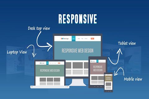
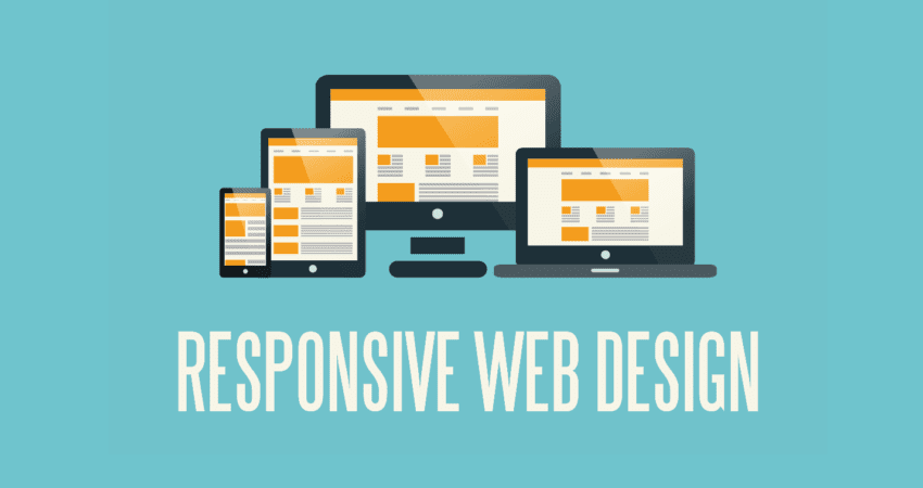
Responsive design is a design approach that aims to create websites that respond and adapt to the user’s device, whether it’s a desktop computer, laptop, tablet, or smartphone. It ensures that the layout, images, text, and other elements adjust dynamically to provide the best possible user experience.
Media queries are a fundamental component of responsive design best practices. They are CSS techniques that allow designers to apply specific styles to different devices or screen sizes. By querying the characteristics of the user’s device, such as screen width, height, orientation, and resolution, developers can tailor the design to suit various contexts. In essence, media queries enable the creation of fluid and flexible designs that seamlessly transition between different devices.
Best Practices for Using Media Queries

- Adopt a Mobile-First Approach: To create effective responsive designs, it’s advisable to adopt a mobile-first approach. This involves designing for mobile devices initially and then progressively enhancing the design for larger screens. Starting with the mobile experience ensures that the core content and functionality are prioritized and properly structured for smaller screens.
- Strategically Choose Breakpoints: Breakpoints are specific screen widths at which the design layout changes. It’s crucial to choose breakpoints strategically based on the most common device dimensions. This prevents unnecessary and abrupt changes in the layout as the screen size increases. Popular breakpoints often correspond to the widths of common smartphones, tablets, and desktop monitors.
- Utilize Fluid Grids: Embrace fluid grids, which use relative units like percentages or “em” for defining widths and heights. Fluid grids ensure that the layout remains proportional across different screen sizes. This approach minimizes the need for fixed pixel values and encourages a more harmonious design.
- Optimize Typography: Typography significantly impacts the legibility and user experience of a website. Media queries can be employed to adjust font sizes, line heights, and spacing to ensure that text remains readable on various devices. Maintaining a consistent and comfortable reading experience across screens is essential.
- Implement Responsive Images: Images play a crucial role in web design, but they can also affect loading times. Use CSS techniques to serve appropriately sized images based on the user’s device. This practice, known as responsive images, ensures that images are clear and load quickly, enhancing the overall user experience.
- Thoroughly Test Across Devices: Responsive designs must be thoroughly tested on a diverse range of devices and browsers. Browser developer tools can simulate various screen sizes and orientations, aiding in the testing process. Additionally, using actual devices for testing ensures that the design functions as intended in real-world scenarios.
- Prioritize Performance Optimization: Performance is a critical aspect of responsive design. Optimize your design by minimizing the use of unnecessary CSS, JavaScript, and other resources. This not only enhances loading speed but also caters to users who might be accessing the website on slower connections or less powerful devices.
Challenges and Considerations

While media queries and responsive design best practices offer a powerful tool for responsive design, there are challenges and considerations that designers should keep in mind:
- Content Hierarchy: Designers must carefully consider the hierarchy of content and prioritize essential information for smaller screens. This might involve reorganizing or condensing content to fit within limited space.
- User Context: Responsive design should consider the user’s context, such as location, device capabilities, and browsing behavior. This can involve tailoring the design for touch interactions on mobile devices or leveraging device-specific features.
- Performance vs. Design: Striking a balance between aesthetics and performance is crucial. While visually appealing designs are important, excessive animations or complex layouts can hinder performance, leading to slower loading times.
- Progressive Enhancement: Alongside responsive design, adopting a progressive enhancement approach ensures that the core content and functionality are accessible to all users, regardless of their device or browser capabilities.
Advantages of Responsive Design and Media Queries

The adoption of responsive design best practices offers a multitude of advantages that cater to both users and website owners:
- Enhanced User Experience: With media queries and responsive design, users can access content seamlessly across different devices, eliminating the frustration of distorted layouts or illegible text. This leads to higher user satisfaction and engagement.
- Increased Accessibility: Responsive design ensures that content is accessible to a wider audience, including individuals with disabilities who may use assistive technologies. By adhering to accessibility guidelines, designers can create inclusive experiences for all users.
- Cost-Efficiency: Rather than developing separate websites or apps for various devices, a single responsive design can serve all platforms. This reduces development and maintenance costs, streamlining the design process.
- Improved SEO: Search engines favor responsive websites, as they provide consistent content and URLs across devices. This can lead to better search engine rankings, resulting in increased organic traffic.
- Ease of Maintenance: With a single codebase for all devices, maintenance becomes simpler and more efficient. Changes and updates can be made once and applied universally.
- Future-Proofing: As new devices and screen sizes emerge, a well-executed responsive design can adapt without requiring major overhauls. This future-proofing approach ensures longevity for your design investment.
- Positive Brand Perception: A seamless user experience across devices enhances the credibility and professionalism of a brand. Users are more likely to trust and engage with a website that consistently delivers high-quality content.
- Reduced Bounce Rates: Websites with responsive design are more likely to retain users, reducing bounce rates. Visitors are more likely to explore and interact with a site that is visually appealing and easy to navigate.
- Social Sharing: Responsive design encourages social sharing, as users can easily access and share content on different platforms, driving traffic and increasing visibility.
- Analytics and Tracking: A unified design across devices simplifies analytics tracking and reporting. Data collection becomes more accurate and meaningful, aiding in decision-making.
Staying Ahead with Responsive Design Trends
Responsive design is not static; it evolves alongside technology and user behavior. Staying current with responsive design best practices involves staying attuned to trends:
- Mobile-First Indexing: Search engines like Google prioritize mobile versions of websites for indexing, making a mobile-first approach essential for SEO.
- Flexibility for New Devices: With the rise of smart TVs, wearable devices, and more, designers need to anticipate how their designs will appear on these novel platforms.
- Performance Optimization: The need for faster loading times and smoother interactions is growing. Designers must continually optimize performance to meet user expectations.
- Variable Fonts: Variable fonts allow designers to create responsive typography that adapts to different screen sizes without compromising aesthetics.
- AI and Chatbots: Integrating AI-powered elements like chatbots can enhance user engagement and provide personalized experiences, even on smaller screens.
- Dark Mode: As dark mode gains popularity, designers need to ensure their designs adapt seamlessly to both light and dark color schemes.
- AR and VR Integration: As augmented reality (AR) and virtual reality (VR) become more prevalent, designers may need to consider how responsive design principles apply to these immersive experiences.
Remember that responsive design and media queries provide a dynamic and versatile framework for creating modern, user-friendly web experiences. By understanding these concepts and implementing best practices, designers can navigate the complexities of the digital landscape and create websites that cater to the diverse needs of users across different devices.
FAQ’s
Responsive design is an approach to web design that aims to create websites that adapt and adjust their layout and content based on the user's device and screen size. It ensures a consistent and user-friendly experience across a range of devices, including desktops, tablets, and smartphones.
Media queries are CSS techniques that allow designers to apply specific styles to different devices or screen sizes. They work by querying the characteristics of the user's device, such as screen width, height, and orientation. This enables designers to tailor the design for optimal viewing on various devices.
Starting with a mobile-first approach involves designing for mobile devices first and then progressively enhancing the design for larger screens. This approach ensures that essential content and functionality are prioritized for smaller screens, resulting in a streamlined and user-focused experience.
Breakpoints are specific screen widths at which the design layout changes to accommodate different screen sizes. They play a crucial role in creating a smooth transition between devices. Strategically chosen breakpoints prevent abrupt layout changes and ensure a more visually appealing and functional design.
Fluid grids use relative units like percentages or "em" for defining widths and heights of elements. This approach allows the design layout to adapt fluidly to various screen sizes, maintaining proportionality and harmony across devices.
Typography optimization involves adjusting font sizes, line heights, and spacing to ensure readability on different devices. Media queries can be employed to modify typography styles based on screen size, ensuring a comfortable reading experience.
Responsive images are images that adapt to different screen sizes and resolutions. They are crucial for maintaining fast loading times and a high-quality visual experience. By using CSS techniques to serve appropriately sized images, designers can ensure that images look sharp and load quickly on any device.
Staying updated with industry blogs, online forums, and tutorials can help you keep up with the latest trends and best practices in responsive design. Additionally, experimenting with new techniques and continuously testing your designs on various devices will contribute to your expertise in the field.
Conclusion
In the dynamic world of web design, where users access content through an array of devices, responsive design has become a necessity rather than a luxury. Media queries and responsive design best practices empower designers and developers to craft websites that seamlessly adapt to diverse screen sizes and contexts. By adhering to best practices such as adopting a mobile-first approach, strategically selecting breakpoints, utilizing fluid grids, optimizing typography and images, and prioritizing performance, designers can create remarkable user experiences that transcend devices. While challenges exist, the potential for creating accessible and engaging web experiences through responsive design and media queries is undeniable. By mastering this art, designers can navigate the complex landscape of modern web design with confidence and creativity.